The origins of wattss: the story behind our name and logo
The company wattss was founded with the clear objective of actively shaping the energy transition and supporting companies on their path to sustainable energy supply. But how did we come to our name and logo?
“Nomen est Omen”: wattss – More than just a word
The name wattss is a creative fusion of the term Watt – the unit of power – and the double ‘s’, which stands for storage solutions. This combination reflects our core competency: the provision of powerful energy storage solutions.
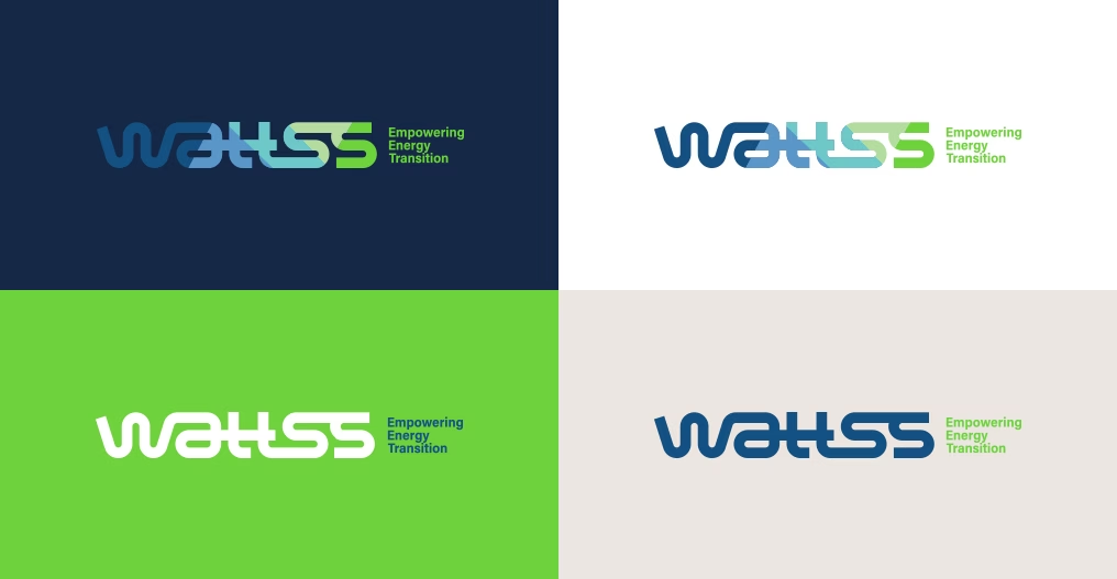
The logo: Symbol for energy flow and infrastructure
Our logo is more than just a design – it tells a story. The design combines technology, energy and sustainability in a clear and modern look and is a fusion of several details.
The double ‘t’ symbolizes an electricity pylon – a deliberate design element that stands for energy infrastructure, power distribution and the central role of grid connection. It shows that wattss storage solutions are not isolated but can be integrated into existing energy systems. The blue and green colours reflect our connection to technology and sustainability. Blue stands for innovation, reliability and precision – essential factors in energy engineering. Green embodies the sustainable transformation that we enable with our battery storage solutions. The flowing and uninterrupted forms and lines, on the other hand, symbolize the continuous flow of energy and are meant to suggest a reliable, stable and sustainable energy system.
Our mission visualized
Both name and logo embody our mission: To advance the energy transition with innovative battery storage solutions and support companies in taking responsibility and designing their energy supply more efficiently and sustainably. We are proud to have created a brand with wattss that clearly communicates our values and goals.
Empowering Energy Transition – that is wattss.